FocusFlow TODO App Case Study
FocusFlow TODO App Case Study
FocusFlow TODO App Case Study
FocusFlow TODO App Case Study
1.
1.
1.
Project Overview
Project Overview
Project Overview
• Role: UI Designer
• Role: UI Designer
• Project Type: Personal
• Project Type: Personal
• Tools: Figma, Adobe Photoshop
• Tools: Figma, Adobe Photoshop
• Goal: The goal of this project was to get comfortable with designing apps that balances accessibility over aesthetics.
• Goal: The goal of this project was to get comfortable with designing apps that balances accessibility over aesthetics.
• Outcome: This project helped me understand various problems that people might face while using the app and how to tackle them.
• Outcome: This project helped me understand various problems that people might face while using the app and how to tackle them.
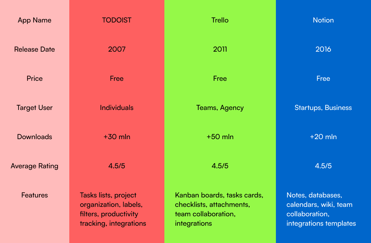
Market Research
2.
2.
2.
Problem
Problem
• Context: There are lot of productivity apps on the market but a common theme I found while surfing these apps were that they weren't too user friendly.
• Context: There are lot of productivity apps on the market but a common theme I found while surfing these apps were that they weren't too user friendly.
• Market Research: Users (age 25-40) wanted a simple, distraction-free design
• Market Research: Users (age 25-40) wanted a simple, distraction-free design
• User Persona: The targeted audience for this app was people aged between 25-50 who are busy with their life and don't have enough time to themselves.
• User Persona: The targeted audience for this app was people aged between 25-50 who are busy with their life and don't have enough time to themselves.
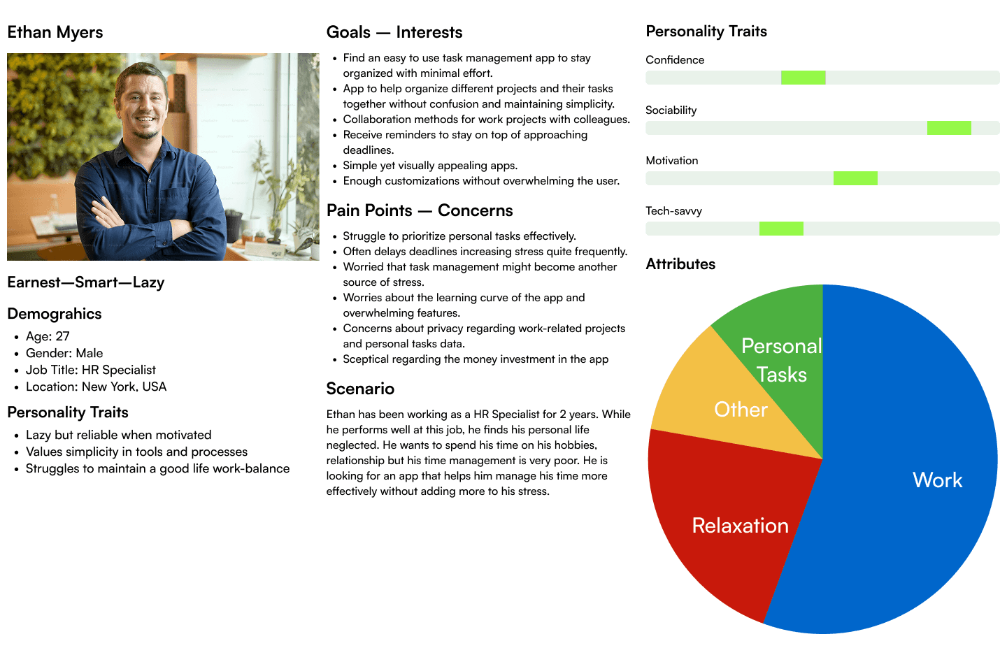
User Persona
3.
3.
3.
UI Design
UI Design
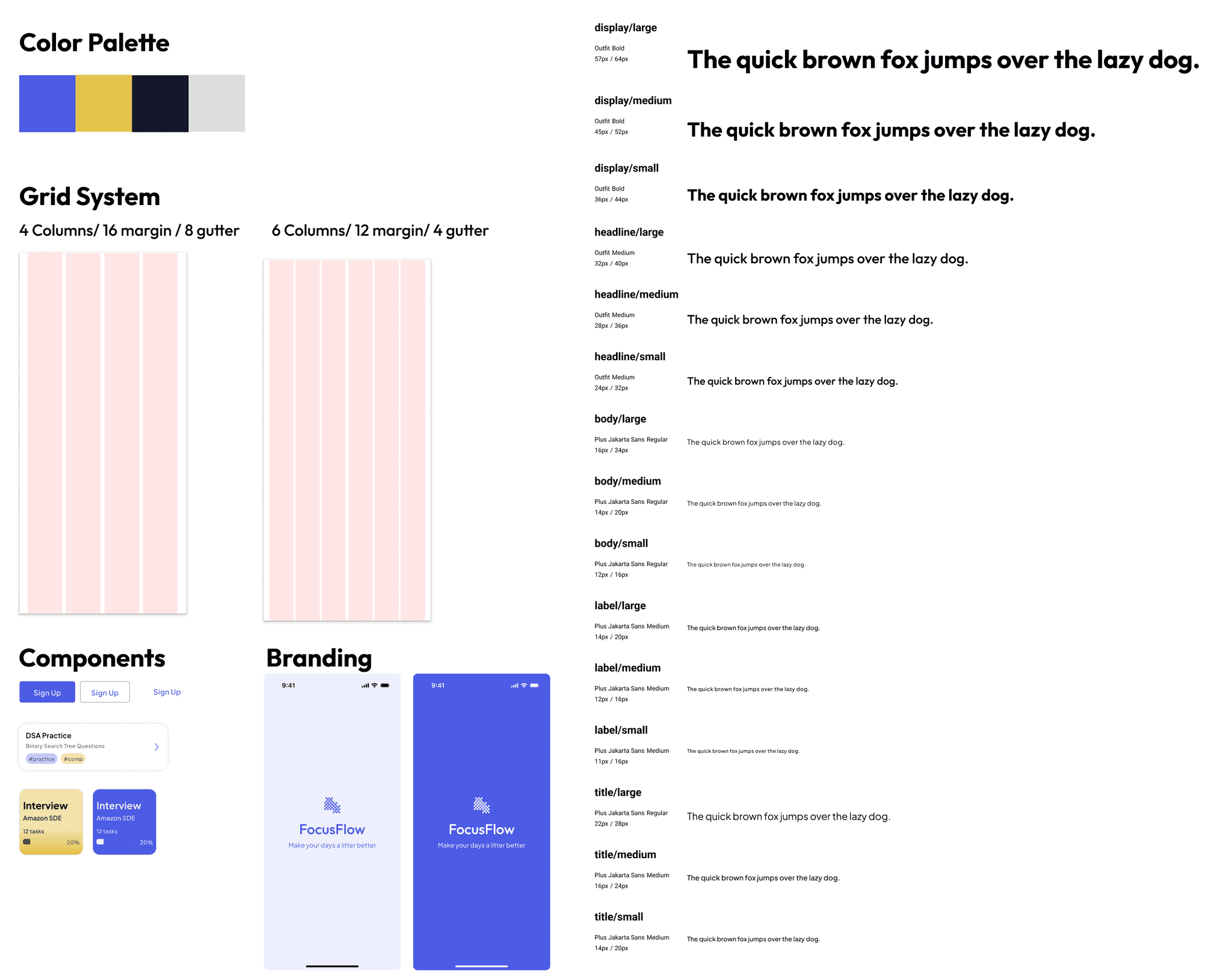
• Color Choice: I wanted to go with a color palette that was comfortable on the eyes and welcoming as the app's main goal was to reduce the user's pile of stress. I went with purple as that's the color that appealed to the app's goals the most.
• Color Choice: I wanted to go with a color palette that was comfortable on the eyes and welcoming as the app's main goal was to reduce the user's pile of stress. I went with purple as that's the color that appealed to the app's goals the most.
Style Guide
4.
4.
4.
Style Guides
Style Guides
• To maintain consistency throughout the designs, it's important to maintain a decent style guide to improve accessibility and branding.
• To maintain consistency throughout the designs, it's important to maintain a decent style guide to improve accessibility and branding.
5.
5.
5.
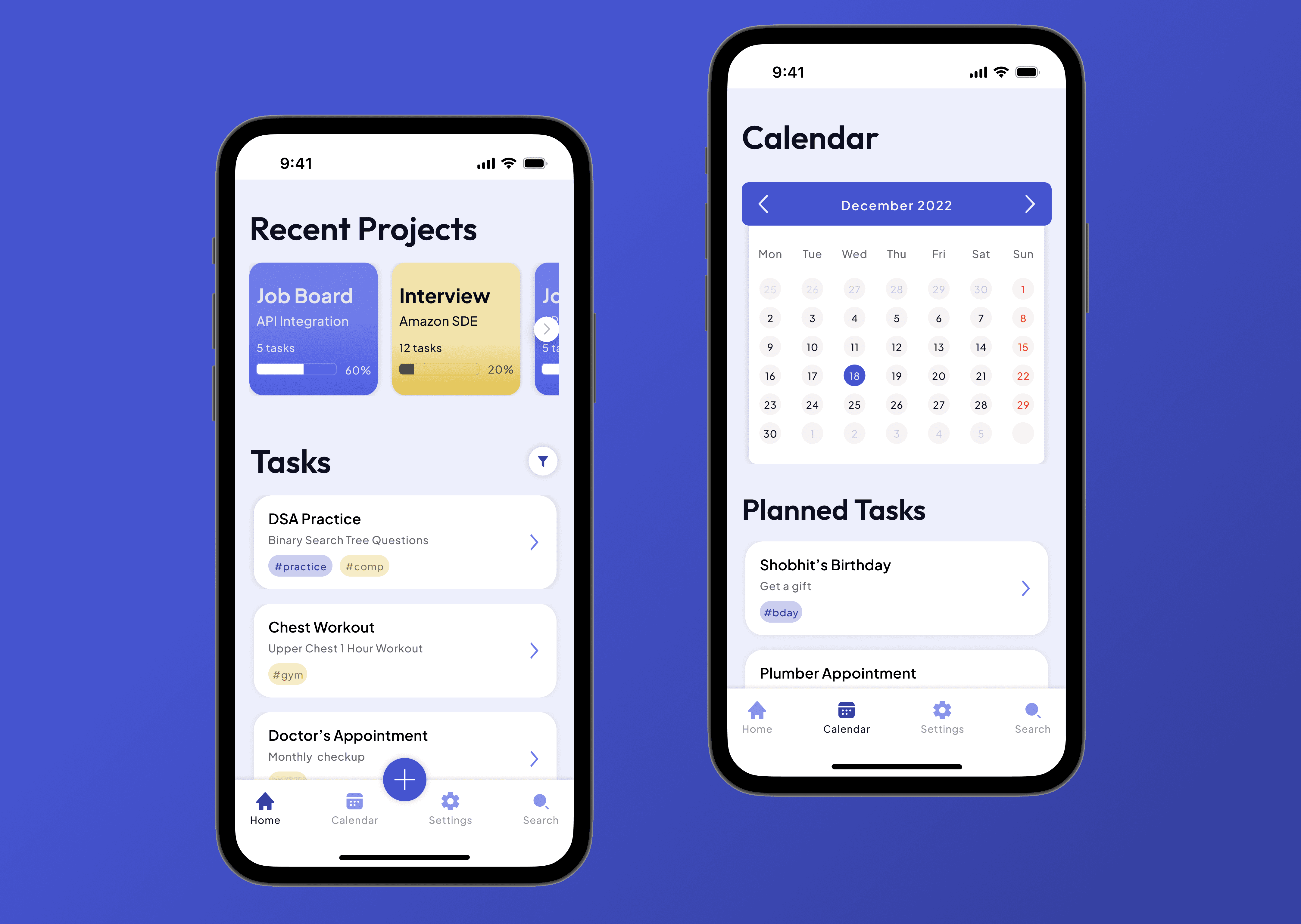
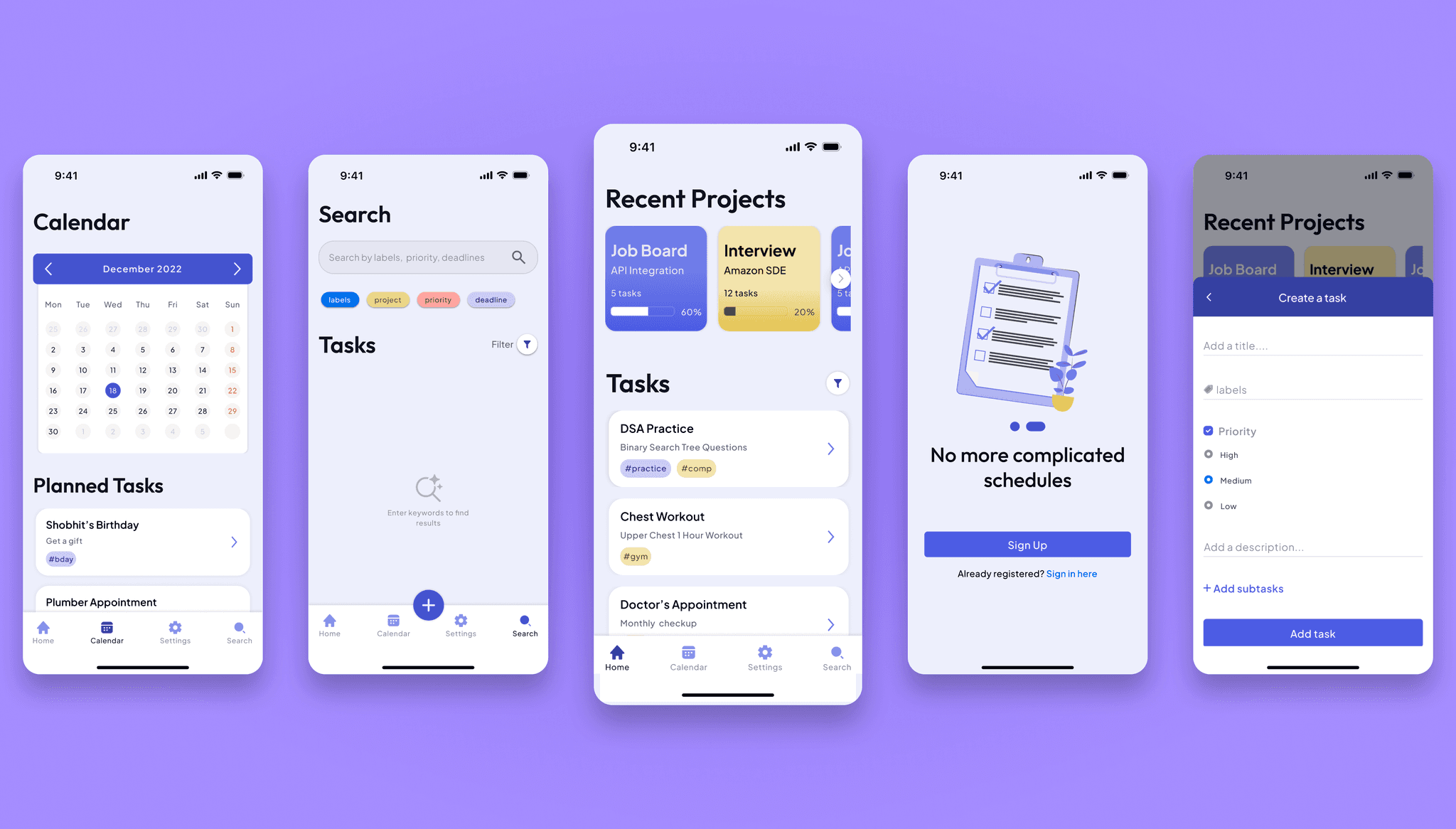
High Fidelity Designs
High Fidelity Designs
• I don't usually do low fidelity designs or wireframes because I think that clients will get a better idea by looking at designs that their apps are going to use.
• I don't usually do low fidelity designs or wireframes because I think that clients will get a better idea by looking at designs that their apps are going to use.
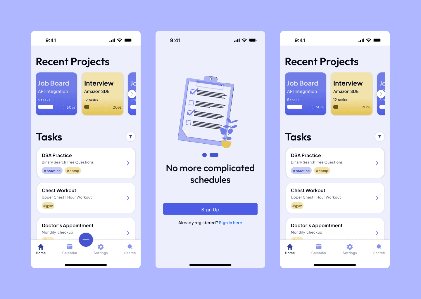
High Fidelity Designs
6.
6.
6.
Common Problems
Common Problems
• Some of the problems I faced during doing this design mostly were related to design complexity. I wanted to make the design as clean as possible but also include the necessary information to make managing tasks easier.
• Some of the problems I faced during doing this design mostly were related to design complexity. I wanted to make the design as clean as possible but also include the necessary information to make managing tasks easier.
• Another issue was creating the task creation overlay, adding all inputs required without cluttering the overlay was hard but I found a middle ground.
• Another issue was creating the task creation overlay, adding all inputs required without cluttering the overlay was hard but I found a middle ground.
7.
7.
7.
Final Design
Final Design
Final Result
8.
8.
8.
Takeaways
Takeaways
• This design made me put more effort into researching the market more and design the UI keeping in mind the target audience. It also made me a lot more knowledgeable about color palettes and using the Android and iOS kits.
• This design made me put more effort into researching the market more and design the UI keeping in mind the target audience. It also made me a lot more knowledgeable about color palettes and using the Android and iOS kits.
FocusFlow TODO App Case Study
1.
Project Overview
• Role: UI Designer
• Project Type: Personal
• Tools: Figma, Adobe Photoshop
• Goal: The goal of this project was to get comfortable with designing apps that balances accessibility over aesthetics.
• Outcome: This project helped me understand various problems that people might face while using the app and how to tackle them.
Market Research
2.
Problem
• Context: There are lot of productivity apps on the market but a common theme I found while surfing these apps were that they weren't too user friendly.
• Market Research: Users (age 25-40) wanted a simple, distraction-free design
• User Persona: The targeted audience for this app was people aged between 25-50 who are busy with their life and don't have enough time to themselves.
User Persona
UI Design
3.
• Color Choice: I wanted to go with a color palette that was comfortable on the eyes and welcoming as the app's main goal was to reduce the user's pile of stress. I went with purple as that's the color that appealed to the app's goals the most.
Style Guide
Style Guides
4.
• To maintain consistency throughout the designs, it's important to maintain a decent style guide to improve accessibility and branding.
High Fidelity Designs
5.
• I don't usually do low fidelity designs or wireframes because I think that clients will get a better idea by looking at designs that their apps are going to use.
High Fidelity Designs
Common Problems
6.
• Some of the problems I faced during doing this design mostly were related to design complexity. I wanted to make the design as clean as possible but also include the necessary information to make managing tasks easier.
• Another issue was creating the task creation overlay, adding all inputs required without cluttering the overlay was hard but I found a middle ground.
Final Design
7.
Final Result
Takeaways
8.
• This design made me put more effort into researching the market more and design the UI keeping in mind the target audience. It also made me a lot more knowledgeable about color palettes and using the Android and iOS kits.